Perform comparative testing with task randomization
How to avoid question order bias when comparing variants and competitors
Here we explain what you have to pay attention to in comparative tests with RapidUsertests, e.g. in writing the tasks and how you can avoid question order effects.
When are comparison tests useful?
- Design comparison: You have several designs for a website, flyer, packaging etc.? Have your testers explain what appeals to them and what strikes them as negative. Which variant would they choose and why?
- Variant comparison: You want to compare several feature variants with each other? Let users of your target group test e.g. different navigation or filter displays.
- Competitor comparison: Do you want to know how your competitors appear to your target group and what you can learn from them? Send your testers to your competitors' websites and let them describe their impression. Read our best practices on competitor analysis.
- Target group comparison: How do different target groups perceive the same website, or how do they handle the same tasks? When creating the test, you can create different target groups that all receive the same tasks.
Within-Group vs. Between-Group
With RapidUsertests you can create both within-group tests (each participant tests each variant or website) and between-group or split tests (the different variants/websites are tested by different participants).
- Between-Group: Create a test for the first variant and copy it by clicking on "Create similar test" in "Your test concept" in your dashboard. Now you can adjust the order of the questions in the new test by drag-and-drop.
- Within-Group: Create a test where you use one item for each variant. Use the randomization feature to avoid order effects.
What are question order biases?
The order of questions in questionnaires can influence the participants' evaluation, because it is above all the first and last answers that we remember best. For your comparison test, this means: If you compare three variants with each other without changing the order between the testers, the testers would probably be more in favor of the first or the last variant.
Avoid order biases with our randomization feature
With our randomization feature, you can determine which of the tasks should be shown to the testers in random order. For example, if you send them to the different websites in tasks 2-4, you simply select these tasks and we show them to the testers in different orders. This way you get valid results in comparative tests.
This is how it works
1. Select the expert features when creating your usability test:

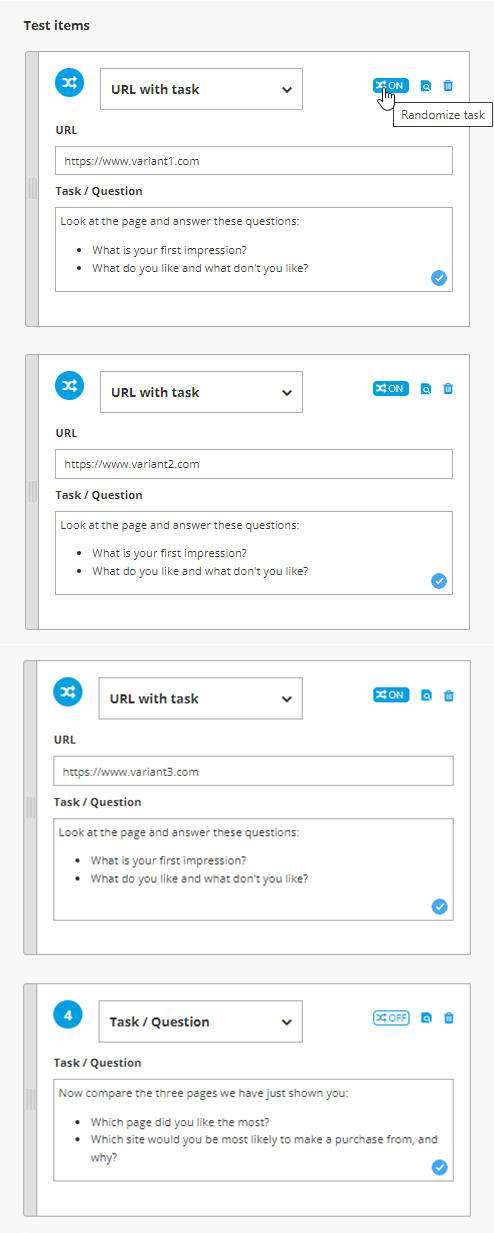
2. Write a task for each variant and select the randomization option for the tasks to be displayed randomly:

In the screenshot, you can also see an example of a possible test concept.
3. When watching the videos, you can see the order in which the tasks were displayed to each tester.
Here's what to keep in mind when creating comparison tests
- Maximum of 3 variants: We recommend that you randomize a maximum of three tasks, i.e. test a maximum of three variants. More choices could overwhelm the testers, especially if you expect them to decide on one of the variants at the end.
- Maximum 20 minutes: Make sure that your test does not take longer than 20 minutes. Alternatively, you can test between-group (see above) or we will charge you an overlength surcharge (for more information contact us at 030 555 747 987, by mail or in the chat below).
- At least 10 participants: In order to get valid results and prioritize the findings, you should conduct comparative tests with at least 10 testers.
- No sequential tasks: Make sure that your randomized tasks do not build on each other. If the testers are to go through entire user journeys for each variant, you cannot ask this in a single test. In this case, create a separate test for each variant.
Do you have any further questions?
Contact us via chat, mail or phone (030 / 555 747 987) or have your comparison test created by a UX expert.
